Wednesday 28 November 2012

Behind the Album: Font Research

Using Dafonts and various other free font sites our group aim to find a font which can encapsulate the modern ere of Hip Hop our artist is so badly trying to convey. It is for this reason that we are looking for fonts that have a slim lined appearance with a strong emphasis on clean cut simplicity.

Acens Stood out to us as it covers both criteria and is bold which is effective when trying to get the album to stand out against other Digipack covers in a store.


Bebas is effective due to its bold and industrial like form. It stands out perfectly well, however I believe it to be somewhat uninspired and not entirely original.


We feel that this font is effective simply as it has a futuristic urban style whilst being clear and concise. Plus the contrast of bold on non bold could be quite useful when we come to trying to trying to differentiate the artist from the album.

Behind the Album: Font research for digipacks

 
After much research into what would be most suitable to include in our digi-packs we have gotten to work looking into the possible fonts we could use. I searched various Hip Hop artists and found that many opted for clean cut fonts that were not very complicated or frilly and focused more on an Arial black style of typography. Aside from Nas, who uses his name as a
 logo and thus does not change the style of the the font used for his name.

One other important element to note would be that the font for the 
album can usually differ to that of the artists font on their name.

Obviously, these are only a select few from the Hip Hop genre and not every album follows this particular pattern. For instance the Akon album Konvicted chooses to go with a slightly wild west themed font. Therefore, instead of going for a run of the mill basic font such as Times New Roman or Arial, I believe we should use a slightly more detailed font with slightly more appealing aesthetics.

Tuesday 27 November 2012

Behind the Video: Editting our Video

Here you can see us assembling the footage into the necessary places using Final cut.


In order to allow each of our group to bring their own ideas to polishing of the video, we made sure to alternate the responsibilities of each of us as an individual.


One of us would be putting together the footage in sequential order and cutting it to fit. The other two of us were thinking over possible effects to add to the video and also possible designs and shots to use for our Digipack.


Behind the Album: Genre Advertising with banner Ads

JAY-Z and Kanye West: Watch the Throne


Here is an advert from the Kanye West MySpace page. It was presented in the form of a banner at the top of the page.It is a small ad previewing Kanye's collaboration album with his fellow Hip Hop artist named Jay-Z. Banners are a an effective form of advertising as they allow me to fit my product into a much smaller space and still create interest through the traffic generated on the sponsored site.


This banner has the name of the album an artist on one side, the name of the album is using imperative commands telling 'somebody' most likely the audience to watch the throne. This use of imperative language is common in a genre which is as masculine and harsh as Hip Hop.

Thursday 22 November 2012

Behind the Album: Creating a Website Header for our Artist

In order to give our fans a place to not only come together to talk about Endomatic and the Hip Hop genre we needed some kind of website and while it would have been nice to create a whole website dedicated to the musician time is at a premium so unfortunately this will not be an option. it is possible however for us to plan out some design ideas for some  of webpage elements that may be featured on our website. For example the header. As a groups we were driven to this idea of the urban lifestyle being represented by mainly graffiti and red brick walls. I really feel that the mock up header design encapsulates these in a fun and interesting way whilst also incorporating all of the relevant information that may be shown on a website header.


Wednesday 21 November 2012

Behind the Video: Shooting the Video

After much planning on where and when we would be filming we finally managed to put it into action and get some really decent shots below are a few images of where we shot our video and what equipment we used:

We brought the platforms at the bottom of the photo (Black Boxes) out to create a extended stage for our artists to perform on and make their performance more dynamic.


Here are three of the various location that feature in our video. These are shots taken before we had edited together all of our footage.  The Drama Studio was perfect for our studio scenes as we could just get the right level of low key lighting and they also had a tuning desk which added to the music video a great deal. The problem we faced during the filming of this scene were the fact that you could see straight into the drama studio through a little glass window just off to the left of this shot meaning we had to use more close up and high  angle shots than we would have liked.

 These are all Images sourced from either my group members phone or the actual video itself and are all relevant to the music video.

Tuesday 20 November 2012

Behind the Artist: Story Boarding

Another key stage in the planning of our music video was the creation of a story board and shot list. Some groups decided to use one board to tell the story and give them guidance in terms of shots. We, on the other hand collectively felt it would be best to create a storyboard of all the videos key moments in order to get an idea of the videos basic progression and then to create a separate shot list telling the individual shots we would use in each part of the song.

Here is the brief over view of the scenes that we planned to film in our video. Creating this kind of storyboard helped form a stable foundation for the assembling of our shot list. We knew exactly which scenes would be featured and so had an environment with in which to generate the best cinematography possible.


Here is the shot list the rest of our groups compiled together to get a good idea of what specific shots we are going to be using in our video. This kind of document really allowed us to understand what shots we would be using, meaning the filming will hopefully be carried out much quicker and run alot smoother.


Sunday 18 November 2012

Behind the Video: Equipment Used

In order to complete our video we needed to utilize the schools media equipment.

I have listed and spoke about each item below:

Item 1: Camera
The most important part of our filming stage was of course the video camera. It allows us to capture our shots in high definition digital quality. The ease of access and usability of the cameras made them a pleasure to film with, plus they never ran out due to the use of a battery charger which was a life saver when it came to filming the next day. Transferring footage was also made much easier, thanks to the use a media import cable.


Item 2: Import cable (Mini USB)
When it came to editing the footage we needed a way of getting our work onto the mac computers. Thankfully the school provided us with media import cables, they helped us out alot however they weren't without fault. At the time the macs we were using, had been updated to a new operating system, called mountain lion. Unfortunately this operating systems was having problems communicating with the macs which meant that some data transferal processes took longer to achieve and therefore ate into our groups editing time.

Item 3: Tripod
This three legged life saver really made filming steady shots a dream. When we initially went out to film our location scouting video, we found that alot of our shots were rocking and were not still. However, after some deliberation over what the cause of this may have been we deduced that it was the fact that the tripods had not been fastened on properly. Thankfully this problem was fixed and the shots are looking much better now.


Item 4: Apple Mac
This was the epicenter of all our groups work. Everything we created from digipack to video was made on here. With its intuitive editing software (Final Cut) to the Firefox application, these computers made putting together our media product quick and easy to do.

Item 5: Studio Lights
In order to control the lighting in the performance part of our video we felt it appropriate to utilize the schools lighting rig. They have two big spotlights each with adjustable stands. We hop these lights will help add an element of polish to our music video and make it look more professional.

Item 6: The software
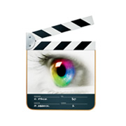
Although they are not actually physical items, I believe that the software we are currently using to create this video is very important, the most prominent pieces of editing and formatting software we have used would be the video editing program, Final Cut Pro. Final Cut allows me to take my footage and cut it together easily and intuitively allowing me to create a professional and polished piece with little difficulty. The second useful application is of course Firefox (I will go into this in further detail in a future post) the internet or more specifically Firefox has allowed me the opportunity to not only write these blog posts but also research and develop my understanding of the music industry and the conventions of the Hip Hop music genre through such sites as YouTube.

Monday 12 November 2012

Behind the Artist: Film Scheduling

I compiled a filming schedule in order to have a clear understanding of when we are going to film. Having the schedule allows us to see clearly were and when we will be during particular point in our day. This kind of organization makes teamwork move a lot smoothly.

Thursday 8 November 2012

Behind the Artist: Risk Assessment

In order for our filming to go ahead it is vital for us to weigh up the possible safety issues we may face during the productions stage. The list is as follows:

Location 1: The School Hall

Risk 1: Cables

Our group are going to be using wires to connect our lights to the mains, these wires could cause problems when we are moving around. They are in the same area as to that of where we are filming and we may be at risk of tripping over. This would either cause damage to us or the school lighting rig. We as a group of director and cinematographers are at risk of tripping as well as our artists who will be coming on and off of the stage regularly and crossing the wire quite a lot too. This I think is quite a serious risk as while we are filming we may forget about the cables increase the risk of  tripping over. In order to combat against this we will plan out the desired paths we will be using most readily; while filming and position the cables so that they are not in these paths.

Risk 2: Raised platforms

A large part of our video is going to be taking part on top of a stage, therefore we feel it best to take the necessary steps to prevent any one falling off of the stage. We will make sure that the stage is clear of any obstruction and that we ave only two people on the stage at any one time.

Risk 3: Electrical Equipment

We will be around many pieces of electrical which could put us at risk of electrical shocks. Both me and my group members and the artists will be at risk however we will be in greater danger.

Wednesday 7 November 2012

Behind the Album: Digipack Analysis

Front of the cover

In class I had the opportunity to analyze one Digi-Pack of the famous Hip Hop artist Proof featuring Derty Harry. Here is what I found during my analysis:

The front cover denote a cartoon figure standing in an alley way, the cartoon effect has been used possibly to play on the idea of an alternate reality and also to put the audience at unease with the artist and his lifestyle. This delivers the message that all Hip Hop artist strive to meet which is that this mans life is like nothing you have seen before.

The color scheme used to illustrate the front side of the album are greens browns and blacks all colors associated with the lower end of town and the lower end of life. These images represent our artist therefore as being, a Man from the poor end of town who has risen from the dirt.

The blatant misspelling of words is a common thread amongst many Hip Hop artists, it is also a theme that features on the cover of this digi-pack. In the top part of the cover underneath proof's title, we see that he is performing alongside an artist named "Derty" Harry, by misspelling the name of a rogue cop, fighting justice against the rules of the law; the artist is able to not only borrow the rebellious image of the movie character but at the same time he can maintain the audiences familiarity with him due to his deliberate misspelling.

Content signs such as weapons and items of clothing will always trigger certain emotions with in the audience towards the artist. To the bottom of the first cover a knuckle duster can be seen to the bottom left of the picture. By using the artists name "Proof" to title the knuckle duster, an immediate link between the musician and the images of violence and anger are created.

A common unity in most Hip Hop videos is the use of the parental advisory sticker to signify the explicit nature of the album. This use of the sticker bigs up the ego of the artist as they create the idea that they are once again a figure who is not to be crossed.

The overall composition of the image is another interesting part of the image. With proof positioned to the left to make room for the words and having his body pointing towards them create the connection between him and his name.

Back Of the cover

Moving to the overleaf we see how names are used to represent the artist and his genre of music. The name of the record label name  is Iron Fist,this relates back to the aggressive image represented by the use of the knuckleduster thus implying that not only is it him and his own music that is dangerous but the people who create his music are to be taken seriously also.


CD Cover

As there was not alot of design on the CD cover I decided to create a short audio clip describing some of the main points of note. Click the link to hear that clip.


Sunday 4 November 2012

Behind the Artist: Vladimir Propp - Fairy Tale Theory

Vladimir believes that every video will include a group of stock characters. They can be seen as being similar to that of a fairy tale.

Many videos will have the Hero figure who will usually be the lead singer or, at the very least the main focus of the narrative. This character will usually be on a quest to find something whether it be emotional or physical.


You may also have other characters such as:

The Villain: Attempt to stop hero on quest 
The Princess: Prize for the hero
The Dispatcher Sends hero on quest 

Behind the Artist: John Berger: Narrative is almost a given..

John Berger argues that we are somewhat preconditioned to make narrative within in any media piece and that in order for our media products to be truly successful they should have a narrative which can help the audience link to the artist. A good example of this would be the video Nickle Back - Photograph, He is performing but he is also driving the narrative at the same time.


An example of were this theory is completely ignored is in the video Gangnam Style, where although the artist is singing and performing it does not bare any direct relevance to the narrative.


Behind the Artist: Firth - 3 Broad Typologies theory

The three broad typologies can help us identify what major elements of the music video are being used to draw the audiences attention. The artist or director of the video will pick out any one of these typologies based on past videos and also what they feel best represents their image.

The Three typologies are:

  • Performance driven: These Videos aim to give a strong feeling of the in-concert experience. by having the camera at the point of view of the audience ( low angle, panning shots) and showing the main artist or band playing their instruments or constricting a song.
  • Narrative: These videos are heavily focused on the telling of a story. Another theorist named Schwictenberg, argues that the common narrative for most videos will be to have a male character who drives the action, whilst a woman character will passively react to the events unfolding in-front of her.
  • Conceptual: Music videos include images which are not related to the lyrics directly and can have various different messages and meanings.
As a group we have decided that our video will have a strong mix of all three elements, however we felt it best to focus a good amount of our time on the narrative part of the video. This will make up a large proportion of our video.

Friday 2 November 2012

Behind the Video: Micro Element #4: Color tinting

Many Hip Hop videos use different color filters to make an effective transition between past and present.

Time Period

The Game ft. Lil' Wayne - My Life


In this video we have both a murky green tint for the poor past and a bright enlightened orange tint for the better future scenes. This use of colour to relate to different time periods is really effective if we want to transist between different periods in our actors life.